Thursday 21 December 2017
Starting to edit our music video
We have started the editing process for our music video. We are using the software Premier Pro to edit and we have bought the song from Amazon to use as the backing track.
Tuesday 19 December 2017
Monday 18 December 2017
Friday 15 December 2017
Sunday 10 December 2017
Monday 4 December 2017
Filming 27th November - South Shields Beach
On Monday 27th November, Georgia and I filmed Luke and Rachael at South Shields Beach for our music video.


Filming 20th November - Newcastle Quayside
On Monday 20th November, Georgia and I filmed part of our music video at Newcastle Quayside. 


Tuesday 14 November 2017
Drone Fail
On Monday 13th November, Georgia and I had plans to shoot some drone footage. Our plan was to meet at the location at 9:20 with Kevin and Zoe, the people who leant us their drone. The drone is a DJ1 Phantom 4 and the film is shot in 4K. After flying the drone, we soon realised that the footage was mot coming through the IPad. The problem was that a few days before the software was updated and was not compatible with the drone. Unfortunately, we could not film anything this day but the filming is rescheduled for Sunday 19th November.
We took some photos on the day:


Monday 13 November 2017
Sunday 12 November 2017


Saturday 11 November 2017


Friday 10 November 2017
Tuesday 31 October 2017
Product pitch
We are making a music video to the song ‘Drive’ by Oh Wonder. To accompany this video, we will also be making a Digipak for the album and a poster for the album release.
I think that our music video will be better than the original because it will be telling a more relatable story. The story our video is telling is of a breakup between two people and the journey one person goes through during the break up. It tells the story of a girl whose boyfriend breaks up with her for someone within the same group of friends. It is shown through a series of flashbacks and present day shots.
The target audience for this video is for anyone (male or female) in the 18-25 age range primarily. We chose this target audience for our video because our two main characters are both around 18 years old and it means that anyone who has been through a breakup or who has broken up with someone will be able to relate to at least one of the characters. The secondary target audience is anyone who has went through a difficult breakup. This is because the audience will be able to relate to at least one of the characters and feel close to the characters and follow their stories in the video.
Monday 30 October 2017

Emails to publishing company
In order for us to use Drive by Oh Wonder for our music video we had to email the publishing company for permission. We found the email address online, the second email is there response and there was no response from the third email.


Thursday 19 October 2017
Music Video Questionnaire
Music Video
Questionnaire
Information about yourself
Name:
Age:
Job/education:
Preferred music genre:
Favourite band/artist:
- Do you like a story to unfold during a music video?Yes No
- Do you like an action sequence during a music video?Yes No
- Colour is a key feature to a music video. What colours would you like to see during a music video?Black and whiteSepiaBlack and white with one colour to highlightCool tones to show sadness and warm tones to show happiness
- Do you prefer music videos that are shot in multiple locations or just one place?Multiple locations One place
- Do you think that music videos with a lot of detail can detract from the song itself?Yes No
- Has watching a music video ever convinced you to buy the song?Yes No
- Do you like humour in a music video?Yes No
Tuesday 17 October 2017
Monday 16 October 2017
Friday 29 September 2017
Monday 25 September 2017
Friday 22 September 2017
Shot Ideas
Millenium Bridge - Luke cuddles Rachael from behind
- they hold hands and swing arms
- always smiling and giggling
- take photos together
- put a lock on the bridge
Beach - eat chips together
- funfair with pretty lights
- drone shots
Car - lipsyncing to song
- Rachael keeps lovingly looking at Luke
- shot of headlights turning on, fade to white as transition


Wednesday 20 September 2017

Tuesday 19 September 2017
Waves by Dean Lewis lyrics
"Waves"
There is a swelling storm
And I'm caught up in the middle of it all
And it takes control
Of the person that I thought I was
The boy I used to know
But there is a light
In the dark
And I feel its warmth
In my hands
In my heart
Why can't I hold on
It comes and goes in waves
It always does
It always does
We watch as our young hearts fade
Into the flood
Into the flood
And freedom
And falling
The feeling I thought was set in stone
It slips through my fingers
Trying hard to let go
It comes and goes in waves
It comes and goes in waves
And carries us away
Through the wind
Down to the place we used to lay when we were kids
Memories of a stolen place
Caught in the silence
An echo lost in space
It comes and goes in waves
It always does
It always does
We watch as our young hearts fade
Into the flood
Into the flood
And freedom
And falling
The feeling I thought was set in stone
It slips through my fingers
Trying hard to let go
It comes and goes in waves
It comes and goes in waves
And carries us away
I watched my wild youth disappear in front of my eyes
Moments of magic and wonder
It seems so hard to find
Is it ever coming back again
Is it ever coming back again
Take me back to the feeling when
Everything was left to find
It comes and goes in waves
It always does
It always does
And freedom
And falling
The feeling I thought was set in stone
It slips through my fingers
Trying hard to let go
It comes and goes in waves
It comes and goes in waves
And carries us away
Sunday 17 September 2017
Update - script
Jesse - This week has been our first full week back at sixth form. We have carried on our research that we started over the summer, our main aim this week was to complete our analysis of music videos. I have analysed the music video of the song Waves by Dean Lewis and the music video to the song we are using. I decided to analyse this song because it included a lot of similar techniques that we want to use in our music video.
Georgia - For my video analysis I chose Don't delete the kisses by Wolf Alice and I also analysed Drive by Oh Wonder, we thought that by doing this we would get the music video from two different perspectives. When they have both been completed we will post them on our own blogs and share them with each other, for the other persons blog.
Georgia - For my video analysis I chose Don't delete the kisses by Wolf Alice and I also analysed Drive by Oh Wonder, we thought that by doing this we would get the music video from two different perspectives. When they have both been completed we will post them on our own blogs and share them with each other, for the other persons blog.
Friday 15 September 2017
Tuesday 29 August 2017
Music video analysis
The music videos I have decided to use for my coursework are Drive by Oh wonder and Waves by Dean Lewis. I have chosen to use these songs because they have a similar narrative to the song we are using for our music video and the music videos themselves have the style of video that we wish to use. We want to include flashbacks that have a filter over the footage and these music videos are perfect examples of that. Georgia will also be doing her own analysis of Drive along with another song.
Digipak analysis
These are the digipaks that I have decided to analyse for my coursework, I have chosen these because the artists have similar music to the song I am using for our music video and the digipaks all have a very plain and simple look, which I really wanted for my digipak. 


Sunday 27 August 2017
Drive by Oh Wonder lyrics
Sat back with the window down
Eighty an hour and the radio loud
The same songs with the same old rhymes
Tell me to shake it off and swing from the lights
But I can't help but drive away from all the mess you made
You sent this hurricane now it won't go away
And I promised I'd be there but you don't make it easy
Darling please believe me
Cause loving you, loving you is too hard
All I do, all I do's not enough
Loving you, loving you
I cannot be loving you, loving you
Loving you, loving you leaves me hurt
All I do, all I do is get burnt
Loving you, loving you
I cannot be loving you, loving you
Count stacks of the routine lies
Funny how easy you could see my blindside
Still the same songs with the same old beats
Sure I could stay but there's a place I'd rather be
And I can't help but drive away from all the mess you made
You sent this hurricane now it won't go away
And I promised I'd be there but you don't make it easy
Darling please believe me
Cause loving you, loving you is too hard
All I do, all I do's not enough
Loving you, loving you
I cannot be loving you, loving you
Loving you, loving you leaves me hurt
All I do, all I do is get burnt
Loving you, loving you
I cannot be loving you, loving you
See I remember all the times you made me covered in crazy
I can't forget about the way you played me
Like I was never gonna change your world
It ended long ago so please just let me go
It ended long ago so please just let me go
Loving you, loving you is too hard
All I do, all I do's not enough
Loving you, loving you
I cannot be loving you, loving you
Loving you, loving you leaves me hurt
All I do, all I do is get burnt
Loving you, loving you
I cannot be loving you, loving you
Loving you, loving you
All I do, all I do
Loving you, loving you, oh
Loving you, loving you, oh
Ooh oh oh oh
Ooh oh oh oh
Saturday 26 August 2017
Friday 25 August 2017
A2 Practical Production
For my coursework for Year 13 I have decided to create a music video with my classmate Georgia, all jobs related to the research and creation of our music video will be shared equally. The song our music video is set to will be Drive by Oh wonder. We have chosen this song because it has a clear narrative that can help create a solid piece of work. We have emailed the appropriate production/recording companies to ask for permission to use this song as it will be on Youtube. For research Georgia and I have decided to analyse three music videos and digipaks each, this helps us in being able to use a range of techniques similar to the desire genre and feel of our music video.
Georgia's blog - georgiadurhammedia.BlogSpot.com
Georgia's blog - georgiadurhammedia.BlogSpot.com
Tuesday 2 May 2017


Monday 1 May 2017
Price change
I have decided to change the price of my magazine from £1.50 to £3.99, I am doing this because although I want my magazine to be more affordable than magazines of the same genre such as Rolling Stone and Q, I also want my magazine to be in competition with these magazines. The price I originally had was far too low for it to even be compared to Rolling Stone and Q. Landslide is still slightly cheaper than these magazines as it is £1 cheaper than Q and about £2 cheaper than Rolling Stone.
Thursday 20 April 2017
Wednesday 19 April 2017
Wednesday 12 April 2017
Tuesday 11 April 2017
Monday 10 April 2017
Sunday 9 April 2017
How did you attract/ address your audience?
A way I attracted my audience is by using colloquial language, this allows the reader to relate to what they are reading and allows them to feel more involved. The language used in the article is specific to my target audience age range, the language I have used is mature but still informal. The reader will relate to this because they will identify with the featured artist.


These are some examples of the colloquial language I have used. As you can see it is still semi-formal and mature language but allows the audience to relate.

These are some examples of the colloquial language I have used. As you can see it is still semi-formal and mature language but allows the audience to relate.
Saturday 8 April 2017
What would be the audience for your media product?- Values and lifestyles
According to Bulmer and Katz Uses and Gratifications Theory audiences make media selections based on the type of gratification they seek.
The primary gratifications Bulmer and Katz identified are:
- -Diversion: Escapism, passing time, release of tension
- -Personal relationship: using the media to fulfil the need of companionship, using the media to form social/ para-social relationships
- -Surveillance/ Cognitive needs: to view others' experiences, to acquire information, knowledge or understanding
- - identity: This works two ways e.g. readers may identify with some aspects of the life of the person they're reading about or aspire to be like them but there's also identity in the sense that readers may become such devotees of the styles of music that you feature that my magazine becomes an important part of their identity so they see themselves as Landslide readers.
I believe my readers will be Experiencers and Strivers.
- Strivers- low resource group, motivated by achievements, fewer economical, social and psychological resources, style is important.
- Experiencers- motivated by self expression, they are the youngest of all the segment with a median age of 25. They have a lot of energy which they pour into physical exercise and social activities.
-
Friday 7 April 2017
What kind of media institute might distribute your media product and why? - Filmed piece script
My magazine will be distributed by Bauer. I have decided to use this distribution company because it publishes magazines like Kerrang and Empire which include some similar conventions my magazine. I will be reinforcing an existing product because my target audience will be similar, however I will also be broadening their audience because my magazine is also aimed at women of the same age as my primary target audience. My magazine is less genre specific than Kerrang, because it includes a much broader range of music genres, this will benefit Bauer by broadening their audience. My magazine is in competition with magazines such as Rolling Stone and Q because they are very similar.
Thursday 6 April 2017
Wednesday 5 April 2017
Tuesday 28 March 2017
Wednesday 22 March 2017
Monday 20 March 2017
Saturday 18 March 2017
Text change on front cover
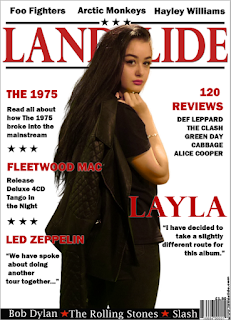
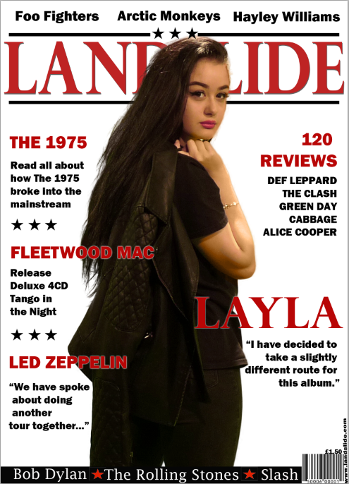
I have decided to change the size of my font on my front cover. The text saying 'Layla' was very big and made it seem as if she was the model on the front cover. To fix this I made the text smaller and added the models name into the review section but made it bigger than the other text with a drop shadow to make it more noticeable.
Wednesday 15 March 2017
Photo change on contents page
After looking over my contents page I decided that I wanted to change the photo on my contents page because it does not fit the theme of my magazine. I decided to use a different model who had a more similar look to what I was going for.


Original image

New image
Thursday 9 February 2017
Colour change on my model
After taking my photos and loading them on to the computer I noticed that my model had some small imperfections on her skin such as a red nose and lighter patches of skin on her forehead where her makeup had rubbed off. To fix this I created a new layer and then used the colour tool and picked up the colour of her skin around the imperfection, I then coloured over the imperfection trying to follow the natural curves of her face. This will make the colour look better but will not blend very well into her natural skin, so I changed the opacity on the layer that I coloured in until I was satisfied with it. I then took the blur and smudge tools and gently dragged the original skin and the colour placed on top until it looked natural. I done this technique on her nose and also the high points of her face where her skin looked patchy.
Friday 3 February 2017
Drop shadow
I had a reoccurring problem when doing my text on my magazine. Due to different colours on my magazine, the text that I put on was not always visible. To fix this problem I added a drop shadow on my text, the white drop shadow that I added on my front cover created a slight glow around it which allowed the black text to be seen against her hair. I also added a drop shadow on my introduction on my double page spread, because the text was a light grey it was hard to see against the white background. A slight red drop shadow on the text made it much easier to be seen and added an extra detail that brought in more colours from my house theme.

Friday 27 January 2017
Double page spread
I did not want to put my article on my double page spread because I felt like it would look too cluttered and the text would not look how I wanted it to. So instead I decided to do a cover page for my article as my double page spread, this would include a picture of my model on one side with an introductory paragraph to my article on the other side.
Wednesday 25 January 2017
Block colour on double page spread
On my double page spread I decided to use a block of colour on the page with the photo of my model, this was to break up the two pages so that it was easier to distinguish between them. I decided to use a light grey colour because it fits in with my house theme but it is also not too harsh like red or black which are the other main colours from the colour palette that i have used for my magazine. To do the block of colour I added the rulers onto the page so that I knew where the centre was and then drew a thin line down the centre. I then drew a rectangle shape and then changed the colour fill to the light grey. To finish I used the rubber tool to rub out the line that I drew down the centre.
Sunday 22 January 2017
Wednesday 18 January 2017
Tuesday 17 January 2017
Photo changes on my magazine
Throughout my magazine production I had a number of changes to my photo choices. I decided on these changes by asking my target audience what they would like to see, I looked at the feedback and decided that the changes would be beneficial to my magazine. The feedback I received was the majority to change my photos.
Black box on my front cover
After changing my photo on my front cover some of the text that I had originally put there was no longer visible due to a background colour change from my new photo. This was a particular problem with the white text on the bottom of my magazine, instead of changing the colour of my text and risk my magazine using too much of the same colour text I used the shape tool to draw a black rectangle the size of the text and place it behind the white text so that it could be seen. This allowed the text to be seen a lot more easily and also drew in more colours from my house style.
The white text to the sides of her legs can now be seen without having to change my magazine too much.
The white text to the sides of her legs can now be seen without having to change my magazine too much.
Friday 13 January 2017
My change in model
After trying to retake my photos a number of times and trying to change the colour of my models skin tone I decided to change the model that I used for my front cover. This meant retaking my photos again and further editing my magazine to fit, however I know that this was the best decision because the overall look of my magazine has improved greatly.
Thursday 12 January 2017
Colour change on photoshop
Over the last few weeks when I have been editing my photos for my magazine I have experienced some problems with my models skin colour. Due to my model having red hair, the false tan that she wears can make her skin appear a lot more orange on camera than what it is in real life. To fix this i retook some of my photos against a white background instead of against a green screen, this made it a lot easier to edit the photos as there was no green glare on my model. Her skin had less orange tones because of this, however to further lighten her skin up I changed the brightness and contrast.
 Photo taken against green background- models skin looks orange.


Photo taken against white background- models skin is less orange and easier to work with.
I further edited my photos by going to 'Image'- 'Adjustments' - 'Brightness/ contrast' and I moved around the dials until I was happy with the final result.
Monday 9 January 2017
Number colour change
Originally on my contents page I used red coloured font for the number pages on the photos, however after looking at it from a distance I noticed that this colour was not very visible or eye catching. To fix this I changed the font colour to white, this still fits into my original colour theme and makes the number a lot more visible.


Saturday 7 January 2017
Centering text on my contents page

To make my contents page look professional I needed to centre all of my text and make it equal distance from the edge of the page. To do this I clicked on the view button in the top corner of the window, scrolled down to show and selected 'Grid' in the drop down box and then clicked on extras. This puts a grid over your whole page so that you can move text to be aligned with the lines.

Subscribe to:
Posts (Atom)